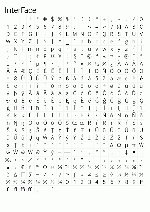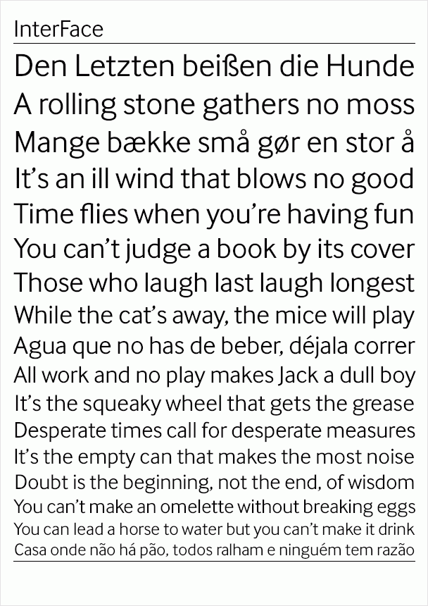

The design of InterFace is influenced by the sans serif fonts of the late 19th Century. While many of the features are Grotesque, a softer look is achieved by blending in some humanist features, such as how the curved strokes meet the straight stems. The fractionally raised x-height allows for a slightly narrower design to increase the letter count where space is at a premium. InterFace’s highly individual design features on some characters support a unique look, which helps a brand or identity stand out from the crowd.


Leave your comment
No comments.
You can be the first one to leave a comment.